Monday, 26 February 2018

Wednesday, 17 January 2018
Grime shots
Grime shots
As our music video falls under Grime i have played attetion to what allows the genre to be shown within the music video. This can be done in a number of ways; props, lighting, camera shots, characters, theme, age,. We have looked at many videos to see what is deemed appropriate and focused on a couple of shots that connect with grime and are common.


From a couple shots we can understand a grime video has the texture of a dim poor lifestyle not showing any type of warm feeling. This projects a hard lifestyle and a version of everyday reality. the characters used appear to be young with a sense of separation but also a unity to become bigger and better. The characters are not focused on up close this allows you to figure out what type of person they are (confusion). Panning, over head shots and long distance shots shows a journey and exploration. a use of juxtaposition.
Genre theory
genere theory
Within lessons at school we have looked at was genre interlinks with the message and theme of a music video. This has allowed me to think more wisely as the where my music video is shot, how its portraid and what age range will help promote the genre. Our chosen song has fallen into "grime". This will have an audience expectation to how it should be filmed. Grime currently involves a large group of people, reality settings (near a block of flats/on a estate), dark dingy colours, tracksuits, a struggled lifestyle and possibly the use of alcohol and drugs. Alongside these expectations we want to intertine a breakaway effect allowing the audience to see a positive outcome at the end of the video. This will allow our message to be shown. We want to show a hard life from the start (this will include the listed expectations up above) from then on we will show a change in life and how trying to be better turns out. to help show this we could use slow motion shots to grasp and show the main message in detail. Panning can be useful as it will show two differences (haven not figured what will be the differences) With our sense of fashion we want to include tracksuits but old versions as modern one will not show a poor lifestyle.
Planning process
Within the planning of the course we need to understand our aims and what we want to reach. This will be listed below:
music video
Any ideas (mindmap, pictures,word jotting)
Cast (auditions)
Costume (type of theme)
Safety (intervine with anything or anyone)
Sound effects
BBFC rating
Equipment (props)
Plan of filming days and location of shots
Updates about any new plans/discusions/ideas
Age range
Message (what do the words mean and signify)
magazine
Message within the magazine
Drafts/sketches/layout ideas
Theme (colour/font/words used)
Artsist
Create a final draft
Age group ?
digipak
Effect of the design
Message
Design
Theme
Age group
Any notes or drafts
Artists and pitch responses
Final design
Saturday, 13 January 2018
initial designs of the poster and digipak
Poster
 With our initial first design of a poster we created a mysterious black, dull poster. The poster as you can see isn't very bold and eye catchy. This could be due to the poster having too much writing on it. Due to our age range starting young, most children tend not to read too much and enjoy looking at artistic pictures. When designing this first draft we now understand what key concepts we now need to change. If our poster is kept like this it will look the same as everything else in a magazine is heavy and full on with writing. I think a black background should be kept as magazines are more colourful but as black is a bold, block colour, the simplicity will stand out.
To change and improve our poster we may use a key feature of our music video that is not to revealing but interesting. This will make the audience more interested into the release of the video as it can show the idea of a story. We also will reduce the writing to not confuse the audience. I think if writing is still produced white block letters should work well with a black background as it can be then clearly understood with a message. The message on this first design will not make sense either with the audience in the future and could mislead them when the video comes out. This could get bad ratings and criticism.
Digipak
With some error of the computer system this first draft is not amazing. The front of the packaging looks very childish and poorly constructed the only beneficial feature of this edit is the two faces makes sense and adds a sense of mystery for the audience. The face works well alongside the video as it corresponds to the main character. However that isn't just the only character and feature in the story, but this could work well as it will come as a better surprise to the audience. For the final design we should change the front from the poster as it just looks boring and repetitive.
 To improve it, more relevant information should be used to make it look professional. We also need to change the font. We could add a bar code to make it more realistic. We also need to work on sizing of the digipak as ours looks rectangular. This shape is not the shape of a CD pack as they are square.
We can still use a character not reveal too much about them as it will be effective to relate it to our video and make more sense.
 With our initial first design of a poster we created a mysterious black, dull poster. The poster as you can see isn't very bold and eye catchy. This could be due to the poster having too much writing on it. Due to our age range starting young, most children tend not to read too much and enjoy looking at artistic pictures. When designing this first draft we now understand what key concepts we now need to change. If our poster is kept like this it will look the same as everything else in a magazine is heavy and full on with writing. I think a black background should be kept as magazines are more colourful but as black is a bold, block colour, the simplicity will stand out.
To change and improve our poster we may use a key feature of our music video that is not to revealing but interesting. This will make the audience more interested into the release of the video as it can show the idea of a story. We also will reduce the writing to not confuse the audience. I think if writing is still produced white block letters should work well with a black background as it can be then clearly understood with a message. The message on this first design will not make sense either with the audience in the future and could mislead them when the video comes out. This could get bad ratings and criticism.
Digipak
With some error of the computer system this first draft is not amazing. The front of the packaging looks very childish and poorly constructed the only beneficial feature of this edit is the two faces makes sense and adds a sense of mystery for the audience. The face works well alongside the video as it corresponds to the main character. However that isn't just the only character and feature in the story, but this could work well as it will come as a better surprise to the audience. For the final design we should change the front from the poster as it just looks boring and repetitive.
 To improve it, more relevant information should be used to make it look professional. We also need to change the font. We could add a bar code to make it more realistic. We also need to work on sizing of the digipak as ours looks rectangular. This shape is not the shape of a CD pack as they are square.
We can still use a character not reveal too much about them as it will be effective to relate it to our video and make more sense.
Wednesday, 3 January 2018
Different genres of music videos
Megan Trainor
Genre - Pop
"Dear Future Husband"
Genre- Dance hall
"Clarks"
Genre- HipHop
"Privacy"
Taylor Swift
Genre - Country
"love Story"
Broods
Genre - Electro-pop
"Mother and Father"
Monday, 1 January 2018
A2 media studies music video evaluation
Through conducting my research i have watched a variety of A2 media studies music videos, following the same criteria. This has allowed me to focus on what has or has not worked out allowing me to improve and evaluate my final piece effectively. This will allow me to experiment different ways to present my message within the music video.
The music within this video is classified as "house". I have looked at house music video and understood the concept of a message. House music has a disconnected sound to it allowing people to let loose and reveal their emotions and personalities. In the video the character has different emotions shown. They have a great range of camera angles allowing it to sink with the music at the correct times. The use of reflections are throughout focusing on the emotions and feeling of the message. The panning or the hand held camera allows the audience to establish the lost environment the character is in and explore the journey with him. The underwater scene really captures the realism of how he wants to escape reality and get away. I found it enjoyable and interesting with the personal view of the protagonist and understood the message really clear as the music has no words to describe the feelings. Towards the end we discover its a flash back to the life he once lived. This was a great scene to show as we understood the type of person he is and what he enjoys doing. It allows the audience to relate to this feeling as we all have a dream or feeling to relive something we have once loved. This video relates to Brecht theory. It makes the audience aware what they are watching was not all reality but theatrical (a dream). it breaks the "Fourth Wall" and keeps the audience as observers to understand the message.
Saturday, 23 December 2017
To do list
We need to finish of recording:
The rich scene (rolex)
A recording of hate messages
Being with friends
Park scene
recording of significant objects
The rich scene (rolex)
A recording of hate messages
Being with friends
Park scene
recording of significant objects
Thursday, 21 December 2017
Analysis of "Shape of you"
"Shape of You"
The song"Shape of You" was originally a pop song by the artist Ed Sheeran. This was a popular song in the U.K that spread internationally. In the process of Sheerans fame the artist Yxng Bane remixed a version of his own, converting it to a grime theme. We can see the genre of pop has intertwined with grime allowing grime to become more popular. Technical convergence has helped the progression of grime and add visuals to a video to release and express feelings with a deeper meaning other than lyrics. Visuals have made artists popular and more recognised when featured in their own songs. The use of codes and conventions have developed powerfully throughout grime, this is seen by the use of hand held cameras panning the protagonist in an urban area; commonly used in grime videos. This reveals the environment and atmosphere the artist is trying to represent they come from in relation to the lyrics. The use of society members through out videos allows the audience relate to their meanings.Ed Sheeran (pop)
The original version of shape of you is by a pop artist Ed Sheeran. His message in the video describes how a relationship began at a bar and quickly lead to a bedroom. Sheeran hints at sexual interaction but doesn't go into depth but his description of sexual interaction allows us to understand it can help a relationship become deeper. He begins his song with "the club isn't the best place to find a lover so the bar is were i go" this enhances that he was looking for a true love by interacting in a calmer environment. The video compromises with the lyrics as it set in a boxing room which is something you "fight" for, in relation to the song he wants her love and eventually achieves it by fighting and working for it. The video is set in an urban area which is very common in grime and pop music, it helps tell a story. The lighting is a dark with dim blue lights that look like city lights, this effect makes it more mysterious and connects with the passion with the two people. The fashion in the video is sporty and helps us understand where the relationship began. The video focuses on boxing which is a use of icongraphy. Iconography can show the link between the person and the story by connecting the two. With Sheeran we can see this as the couple connect through the use of boxing.
Yxng Bane (Grime)
However much like Sheerans narrative it still revolves around a girls. In comparison we can distinctively see how grime is showed. We can see the use of drugs, and expensive car and designer clothing. In Sheerans none of that is deemed to be center of attention or cared for only. Banes video is primarily based on the girl dancing around him rather than with him. She is seem to be an object. The grime feel has a materialistic point of view to it. From this it helps us how to represent the grime genre as we can see what things the camera angles should show. We can also see the way Bane is more direct to to the camera as he sings the word at the camera more than Sheeran. This is big deal as it helps connect the public to the song and relate potentially. The environment is pretty empty from a the high top view to focus on the two characters. The lighting is natural and doesn't highlight anything in particular. The use of wealth shows from the car can signify what type of audience will be interested; we had thought the youth as the younger generations play more attention to the brands rather than an older. The characters used are much younger than the people in Sheerans which helps suggest the age range aswell. The story line in Sheerans is panned out and walked through as the grime version is as subjective and has more fast cut clips with a range of motion.
From gathering research for our final product we intend to interpret factors that were included in Bane's. However we may challenge the convention of the male role and allow a woman to take the lead as its commonly known for the woman to be the subject which we want to challenge to make ours more unique
Yxng bane - Rihanna
In the process of recording we had a trial practice of copying the same action and scene of a song called Rihanna by Yxng Bane. This allowed us to understand the message of grime and the traits needed to make a successful video. We thought practicing this would help find ideas of camera angles, props, positions and environment. In the video there is a clear edit of colour which helped us practice using final cut pro. It was useful to understand this as we have to use this in our music vdeo to help commence our video. A lot of editing on final cut pro allowed us to use transitions and the blade to piece together to allow it to run at the same time of the music video.
From our trial run we a understand that Grime artists tend to use a a story when creating a music video. The part we recorded from Banes video focused on a lonely, young woman that has been heart broken by a possible ex boyfriend that is attempting to contact her. The woman shows uncertainty and a negative energy. From the clothing worn we understand she doesn't care how she looks and wishes to not make an effort in her appearance. This can signify the upset she is suffering as nobody else shows her care or compassion. Clothing can tell a lot about a persons characteristics so we tried to copy this by using the over-sized, off the shoulder t-shirt. The setting in her kitchen but contrasted by the dim lighting signifies it may be late evening but perhaps she has just woken up. The woman acts distracted as if her mind has a lot to deal with. We can see this as she just sits around not doing anything and the panning of her environment. The prop of Smoking can also abuse her body that shows signs of dismissal upon herself.
For props we used a shisha pen that was equivalent to the smoke she was smoking. This worked effectively as the smoke was thick and visible allowing the audience to see the replica.
The camera angles helped us portray different emotions. The close up reaveals their feelings/emotions. The panning shows that maybe its a feeling that had lasted a long time. It also helps having a overhead view to show she is the vulnerable one. We used zoom to focus on the narative of being lonely and mimicing the narrative.
For future reference we will improve our environment to give of a deprived background of the person. The mise-en-scene introduces an individuals life. For our actual music video we will focus on being able to Show this by taking away most or any expensive items to tell this story. It is important that the audience can relate and understand our message as it will allow our video to have more views and praise to the production. When we conduct our music video we could consider lighting as it creates an atmosphere of emotions. Preferably for our video we want a dream conveyed so the use of shadows and dim lighting can show the struggle of their goal. "left in the dark".
Friday, 8 December 2017
Risk assessments
There are various risks to shooting/recording things, however as one of our shots will be in a shop we will need permission as they could think we are recording to gain information about the layout to potentially rob the place in the future or any other risk from recording the shop floor.
If a scene contains others as a shot of our character in contrast to a group of young adults we would need permission to record them as we will publicly put out he video and anyone could find information about the individual.
Props

One of our props used in the music video shall be a used bike. This is used to show how the person lives his life on a daily. We want an old beaten/used bike as it shows the person has done mileage on the bike and uses it often.The bike will not be top of the range as we want to show how they build their fortune and climb the ladder to the top and travel in other way eventually. The tyres will be lat as it makes it tougher to travel and we are trying to emphasises his life is hard.

We aim to include expensive cars as it will contract with our character that they are not rich. I believe it will be effective as every young child dreams of living lavish and experience driving a big rich car.
Ideas for location


We had various ideas of locations to shoot in. One idea is on a real estate area that represents the lower working class people, that may potentially struggle to keep their earn. The use of estate is more of a real lifestyle that people will relate to as majority of the public dont live in big fancy houses. Graffiti-ed backgrounds represent the suffering of the youth and a way in which they express themselves; to capture this in a shot will help bring the urban/grime lifestyle into account for as is shows the abannedness in the life of our person and nobody cares about what they do. Graffiti is not allowed and using this shows the lifestyle of our person might not always be legal but its their way of living but mean no harm.
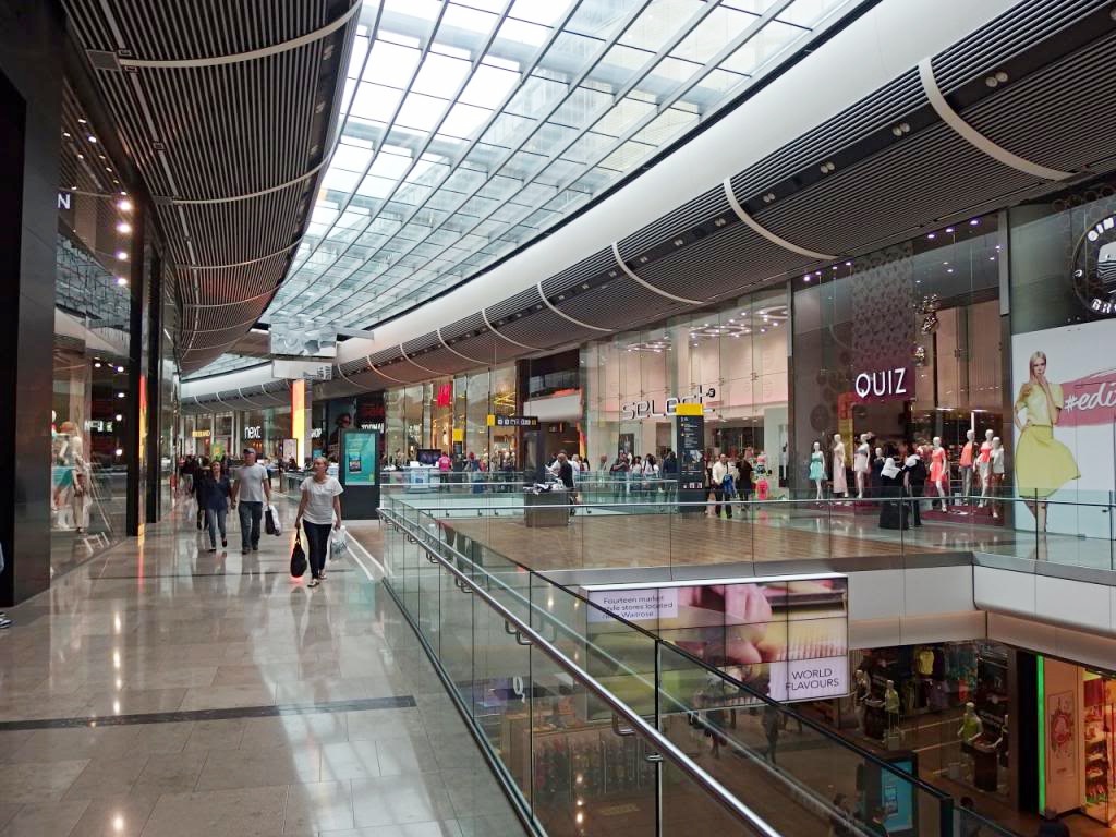


In contrast to the urban lifestyle we wanted to show the other side to life and how our person would like to live. Our first idea was to have our character watching others shop and window shop. This separates our persons lifestyle and how they know they need to change their lifestyle. By shooting in a shopping center that has high end fashion shops, which costs a lot of money to shop in our lead person will represent this as either a dream that would loved to be lived or is true and has worked their way up through the struggle and now live the opposite lifestyle. We need a shot of fancy objects preferably diamond/sparkly based this theme links to money as it looks expensive.
Subscribe to:
Posts (Atom)