Thursday, 8 March 2018
Blog
On my blog I changed the background colour setting to assist the genre of Grime. As used on many grime digipaks we also used black on our one aswell I think using this black/grey colour helps set the mood and meaning. The original dark black wouldn't allow people see the digipak properly (the boarder) so I used this black/grey effect that helps distinctively see the designs of the digipak and magazine.

Question 4 - How did you use media technologies in the construction and research, planning and evaluation
When creating our final video we used different technology formats to do this. These were:
Main product

 Final cut pro - During post-production we used final cut pro to edit our music video. It allowed us to uses tools to incorporate transition of the final cut pros own transitions. This is seen at 0.56 seconds. This helped speed up the narrative as the clip followed was sped up to make it more engaging as it would get boring watching someone walking. It was sped up by 50%. We also slowed down clips in slow motions to show the positive vibes in a party and how friends occur. The slow motion worked effectively a we also slowed it down by 50%. We used the tools such as the 'blade' to cut our original video in time with the music. If there was not tools you wouldn't be able to create the music video effectively and you will over hear original sounds and out or tune. We trimmed/cropped different parts of footage we gathered. Finally we used time line to rearrange the order of the shots and put them together.
Flvto - To include the music we used flvto converter to convert the music from youtube into audio only. The was needed as we only wanted the audio as our task is to create a music video. Final cut pro allowed this to be compatible.
www.flvto.biz/

Youtube - We used youtube as the platform as to where we uploaded our music video.
Digipak
 Paint -We used paint to design our digipak and magazine. We began to edit both on photo-shop, but due to technical difficulties we could access the app. We used tools (shape tools) to create the circle in the middle. Text was placed front and back listing songs our digipak also contains. The advert contains text that explains availability and where to purchase the album. We also used paint to split the two portrait pictures and combine the two together.
 Microsoft Powerpoint - We used Powerpoint to create the front and back title to also curve around the circle. We also used this platform to copy and paste Spotify and Apple music symbols on the magazine advert.
In addition in nearly every blog post we have used screen shots on from the Apple Macs in class. You are able to take a screenshot by using the keyboard in this order: shift+command+4, you then click and drag the mouse over the chosen area.
Main product

 Final cut pro - During post-production we used final cut pro to edit our music video. It allowed us to uses tools to incorporate transition of the final cut pros own transitions. This is seen at 0.56 seconds. This helped speed up the narrative as the clip followed was sped up to make it more engaging as it would get boring watching someone walking. It was sped up by 50%. We also slowed down clips in slow motions to show the positive vibes in a party and how friends occur. The slow motion worked effectively a we also slowed it down by 50%. We used the tools such as the 'blade' to cut our original video in time with the music. If there was not tools you wouldn't be able to create the music video effectively and you will over hear original sounds and out or tune. We trimmed/cropped different parts of footage we gathered. Finally we used time line to rearrange the order of the shots and put them together.
Flvto - To include the music we used flvto converter to convert the music from youtube into audio only. The was needed as we only wanted the audio as our task is to create a music video. Final cut pro allowed this to be compatible.
www.flvto.biz/

Youtube - We used youtube as the platform as to where we uploaded our music video.
Digipak
 Paint -We used paint to design our digipak and magazine. We began to edit both on photo-shop, but due to technical difficulties we could access the app. We used tools (shape tools) to create the circle in the middle. Text was placed front and back listing songs our digipak also contains. The advert contains text that explains availability and where to purchase the album. We also used paint to split the two portrait pictures and combine the two together.
 Microsoft Powerpoint - We used Powerpoint to create the front and back title to also curve around the circle. We also used this platform to copy and paste Spotify and Apple music symbols on the magazine advert.
In addition in nearly every blog post we have used screen shots on from the Apple Macs in class. You are able to take a screenshot by using the keyboard in this order: shift+command+4, you then click and drag the mouse over the chosen area.
Question 3 - What have you learned from your audience feedback?
Through the production of our music video we had included the audiences opinion all the way through. This had helped us better our video to help it become more successful. Our audience feedback was from or chosen age range to help make it suitable for them. We mixed the gender too. We had asked a couple questions prior to the final product to work alongside it and better the outcome.
The questions asked before the end product were:
Does the narrative relate to the words?
In the start we had one girl starting off rich. We discovered it didn't really make sense as we started her off as rich then switched to a beaten down park scene. The respondent had stated they didn't quiet get the moral of the story due to the words talk about achieving things and mentally think you cant. The first scene which suggested that she was already rich didn't state the goal achieving aim. This would have only worked if we reversed the video in ways of editing to make later scenes look like the past. This would have wasted time and made it more complex for the young audience to understand. It also doesn't compromise with the genre of grime as their story isn't long clips but more short and snappy.
Does the video fall in the genre of grime?
The respondents had stated that they believe it does and to of made it strong when later filming add more designer brands to represent the urban fashion and age the character is. This helped a lot we want the character to fit in with the audience we are entertaining.
At the end of our we asked for more audience feedback which consisted 5 questions.All respondents were within range of the target audience age. The questions were:

1) What can you interpret from the narrative?
2) Did the character/s carry out the narrative effectively
3) Did the digipak and magazine cover combine well with the main product?
4) Does the video match the message/style of the song?
5) Is the construction of the video professional and clear?
1) What can you interpret from the narrative?
In our responses from our audience, they all agreed that they understood the narrative. They said they could clearly see that its young people looking to be well off and possibly popular or build positive relationships. They could also see they are lost in their life and strive to live a better life. One response did question if they were already popular as they went straight to a party in one scene, but as the video proceeded it was made clear their life had started to change. This was a tiny concern but succeeded to answer within the video as we didnt need to explain. Our moral was to jump back and fourth into the future as grime videos have looks on their past and present life. The group stated that they really enjoyed the final reverse scene as it captured their life and how it had changed start to finish. From this i believe we had succeeded to the grime genre as we managed to tell a story much like the aim of grime is.
2) Did the character/s carry out the narrative effectively?
We had really positive responses for the audience when asking this question. They had noticed the designer labels that we intended to include to narrative to show the goal and mentality of today's society. The character's used helped set the tone and represent the genre of music. One had stated they were all relate-able characters the explained and represented the dream of most of the youth and how many live currently. This was a really successful response as we relied on our character's to explain a story through actions and fashion. The respondents had also said the narrative shows its mainly suited to the youth (our audience age chosen) as the characterization was spot on to how in reality we commonly see the youth act. The was spotted in the window shopping scene around the town center and hanging out in a park. In addition, I believe we achieved the correct atmosphere from the characterization shown throughout.


3) Did the digipak and magazine cover combine well with the main product?
The respondents were overly confident with our designs but understand the digipak more and how it combines with the main product, due to the face being shown. It helps represent the start to finish. However, the feedback had stated they understand the design and how its related to grime music which is positive. They said the use of cartoon supports the grime look. We understood there may be questions on the relation between the ancillary task and main product as we did question ourselves. But due to the update that erased our original work this last minuet design focus more on the grime look which is most important to us. When creating the magazine and digipak we did anticipate a negative response.
4) Does the video match the message/style of the song?
From our audience feedback we discovered that it was all basically linked throughout. We had really positive feedback in the responses. They stated the specific scenes that matched the narrative
 This was scene they spotted that matched the words of 'i stir the ship im the captain'. They managed to interpret from the camera angles the word play signifies that the character is stirring her own ship and leads her own life. They could she from the low camera angle she looks powerful and in charge when stating these words in contrast to the rest of video.
The respondents said the tone and layout had fit the nature of grime and the moral of the song itself. This is something we strived for to make the narrative clear and relate-able. One respondent did comment on the bright colour/lighting used much like the yellow jacket as it isn't very urban or beat done, but understood its something a young person would wear to represent their age.
5) Is the construction of the video professional and clear?
In the final question we had mixed responses that were contributed from their response. The stated it didn't not look like an amateur piece of work as it clearly constructed well to the narrative.
The panning scenes for smooth and looked professional with the quality input. They had said the editing was clear and transitions were barely noticeable and worked well with each scene. They also said the combination of two people worked well as we made them similar to each other. Editing is very important in grime videos as it can be jumpy and is hard to make cuts run smooth. Ours were said to not look like different recordings and it was all in one. When done right the audience can understand the narrative better which was said to be very clear. The visuals were said to be well performed and very professional which makes it more enjoyable to watch. This was amazing feedback to hear our music video had to look professional in order to satisfy an audience and not the original song owner and attempting to promote them in the best way possible.
The questions asked before the end product were:
Does the narrative relate to the words?
In the start we had one girl starting off rich. We discovered it didn't really make sense as we started her off as rich then switched to a beaten down park scene. The respondent had stated they didn't quiet get the moral of the story due to the words talk about achieving things and mentally think you cant. The first scene which suggested that she was already rich didn't state the goal achieving aim. This would have only worked if we reversed the video in ways of editing to make later scenes look like the past. This would have wasted time and made it more complex for the young audience to understand. It also doesn't compromise with the genre of grime as their story isn't long clips but more short and snappy.
Does the video fall in the genre of grime?
The respondents had stated that they believe it does and to of made it strong when later filming add more designer brands to represent the urban fashion and age the character is. This helped a lot we want the character to fit in with the audience we are entertaining.
At the end of our we asked for more audience feedback which consisted 5 questions.All respondents were within range of the target audience age. The questions were:

1) What can you interpret from the narrative?
2) Did the character/s carry out the narrative effectively
3) Did the digipak and magazine cover combine well with the main product?
4) Does the video match the message/style of the song?
5) Is the construction of the video professional and clear?
1) What can you interpret from the narrative?
In our responses from our audience, they all agreed that they understood the narrative. They said they could clearly see that its young people looking to be well off and possibly popular or build positive relationships. They could also see they are lost in their life and strive to live a better life. One response did question if they were already popular as they went straight to a party in one scene, but as the video proceeded it was made clear their life had started to change. This was a tiny concern but succeeded to answer within the video as we didnt need to explain. Our moral was to jump back and fourth into the future as grime videos have looks on their past and present life. The group stated that they really enjoyed the final reverse scene as it captured their life and how it had changed start to finish. From this i believe we had succeeded to the grime genre as we managed to tell a story much like the aim of grime is.
2) Did the character/s carry out the narrative effectively?
We had really positive responses for the audience when asking this question. They had noticed the designer labels that we intended to include to narrative to show the goal and mentality of today's society. The character's used helped set the tone and represent the genre of music. One had stated they were all relate-able characters the explained and represented the dream of most of the youth and how many live currently. This was a really successful response as we relied on our character's to explain a story through actions and fashion. The respondents had also said the narrative shows its mainly suited to the youth (our audience age chosen) as the characterization was spot on to how in reality we commonly see the youth act. The was spotted in the window shopping scene around the town center and hanging out in a park. In addition, I believe we achieved the correct atmosphere from the characterization shown throughout.


3) Did the digipak and magazine cover combine well with the main product?
The respondents were overly confident with our designs but understand the digipak more and how it combines with the main product, due to the face being shown. It helps represent the start to finish. However, the feedback had stated they understand the design and how its related to grime music which is positive. They said the use of cartoon supports the grime look. We understood there may be questions on the relation between the ancillary task and main product as we did question ourselves. But due to the update that erased our original work this last minuet design focus more on the grime look which is most important to us. When creating the magazine and digipak we did anticipate a negative response.
4) Does the video match the message/style of the song?
From our audience feedback we discovered that it was all basically linked throughout. We had really positive feedback in the responses. They stated the specific scenes that matched the narrative

The respondents said the tone and layout had fit the nature of grime and the moral of the song itself. This is something we strived for to make the narrative clear and relate-able. One respondent did comment on the bright colour/lighting used much like the yellow jacket as it isn't very urban or beat done, but understood its something a young person would wear to represent their age.
5) Is the construction of the video professional and clear?
The panning scenes for smooth and looked professional with the quality input. They had said the editing was clear and transitions were barely noticeable and worked well with each scene. They also said the combination of two people worked well as we made them similar to each other. Editing is very important in grime videos as it can be jumpy and is hard to make cuts run smooth. Ours were said to not look like different recordings and it was all in one. When done right the audience can understand the narrative better which was said to be very clear. The visuals were said to be well performed and very professional which makes it more enjoyable to watch. This was amazing feedback to hear our music video had to look professional in order to satisfy an audience and not the original song owner and attempting to promote them in the best way possible.
Question 2 - How effective is the combination of your main product and ancillary task?
When developing our music video we questioned many factors. This helped us make wise decisions and solved any issues we did or didn't agree on in the process. The main questions always kept in mind were:
Does our product aim to please our target audience ?
Did we follow our purpose ?
Did all three components link together (digipak, magazine cover and music video)
I believe our target audience should be satisfied with our outcome. This is because we ensured in many different ways to keep our audience in mind by researching/planning ways to do this. Our video tells a story with different clips that are different duration's. This reduces boredom and engages the audience to witness the ending. In addition whilst telling the story we experimented with effects to allow the scenes to run smoothly for a clear understanding. We can evidently see this at 0.55 seconds into the video that matched the scenes to the right rhythm of the song lyrics. In many grime videos such as 'Fine Wine' by Kojo Funds there are also many snappy, quick cuts which also helps contribute to reducing boredom. The cuts are timed and sometimes slowed down. From watching this we imparted this into our video by changing shots dramatically in time with the music. This allowed us to combine the two characters and follow the narrative of a common dream, young people share. The change of people is seen at 3.53 seconds. This introduces another story that is more exciting for the audience, much like Fine Wine and use the two people to support the narrative. We can see that this fluidity of editing is a positive impact as the Kojo Fund received over 12 million views on this video. As we used this as an influence we should hopefully succeed with our video.
Grime artist often sing into the camera to engage and relate with the audience. This is direct connection with the audience that can help keep them satisfied and understanding. We see this in almost every grime video whilst other clips include back and fourth. In most videos its normally the chorus that is in sync with the narrator. For our video we ensured each time the chorus was played we connected with the audience and sang in time. This helps the video feel more realistic as the words mean something.
Our target audience is a range from 12 - 25 years of age and anyone else that may enjoy grime. This is a young urban generation in today's world that has a huge contrast to past artists that focused in this genre. The age range are into urban clothing (brands like addidas, rolex, etc) and enjoy the feeling of money, friends and parties. We had done this by asking multiple people (different age) what they like to do in their spare time/enjoy doing, etc. The responses we all relatively the same; 'i like to go out shopping', 'being with my friends' and 'going out'. To keep our video up-to-date we interpreted these responses to make our video as current as possible and entertaining.
Another idea that we thought was appealing was the use of two different characters. We thought it would be more of a liability to support the dreams that children face. We thought more than one person would make it more interesting. The editing was according to the tempo and made sense to the lyrics which helped make sense of the story to the audience to entertain their attention. We also alternated the clips which is common in grime videos. This can give a related effect to the audience.
We also made our made sense of our purpose from camera angles. In grime its very common to focus on the expense of items. They also use a lot of panning of the camera, close up shots and mirror reflection to do this. This is seen in Jhus 'Bouff Daddy'. From these angles it more fast pased and reduces boredom.


From this reflection shot we interpreted it into our. We thought it would be more interesting for the narrative and appeal. It helps us see what the character is like and changes the perspective on them. This is useful in grime videos to give it a positive reflection on intentions.
Our digipak and magazine advert are closely connected. Our magazine and digipak both include a black background with a colourful image. This makes the narrative stand out. 'The golden child' is a quote we thought would be effective as it can make the audience more intrigued from the meaning behind it. We can see our digipak consists of the same person. This can be intriguing for the audience and make them feel the urge to find out more about the narrative. However the use of a black background is very common when designing as it makes the narrative stand out more. Having two simple designs makes it clearer for our audience. We kept in mind the age range and didn't want to much on the designs as they may not be able to understand. Both designs are connected to each other through the same idea of a black background. This supports the idea of recognition as if one is seen it can remind you of what it is. This worked with the idea of 'Not3s - The Golden child'. This pushes the name forwards and promotes 'Not3s' more as the audience can make a connection.
Our digipak worked alongside the conventions of grime digipaks. However this design does contrast with out music video as the background colour is dark but our video doesn't really consist of dark colours. We used black as it could represent the serious design which kind of links with our music video as its a deep matter that society share. Darkness help's represent a struggle which is our narrative. The darkness is almost emotionless and both designs take itself seriously. We have created a juxtaposition as we created quite an inspiring music video that the audience can respect as we have represented them and proved things can change for the good. Due to the designs being dark it creates a contrast that may be more negative than positive. We have given the brand two different images to work from and be promote; The negative serious side and positive, goal achieving side. The negative serious side of the magazine and digipaks represents the brands message that they work hard and take music seriously as to where the are trying to get to. This message turns positive in the music video and portrays the positive ending. This worked well as the audience can respect the grind of reaching their goal and helps inspire others. This reduces the criticism as it reflecting society and something people may have in common. However some may think its about materialistic things to be content with life. in addition to this possible criticism we used the scenes of friendships and love that can show ts whatever makes an individual happy and sad in today's society a lot is materialistic but its still okay to have dreams. Its normal. The combination of our main product and ancillary task combines well as it puts across our message with a positive outcome and reveals that everyone has dreams but nothing should hold you back other than yourself. The respectful narrative in the video support the message and gives off empathy for those that are only trying to succeed. This can surprise the audience from looking at the digipak and magazine cover.


Lots of grime designs have a cartoon style writing or design with black backgrounds which is what we done. It more current and less old fashion so it can appeal to our age range. It may also be easier to read as young people tend not to like reading much. A design followed this layout description.


These two artists Pins and Fredo use the the style of a black background as it reveals their narrative may have deep meaning and a strong narrative. The use of bold, colourful images stands out. It is visually clear and can see one may be about a girl and the other of maybe a childhood dream (the icecream is childish) but contrasted with the diamond ring and manly hand. We feel our digipak works alongside grime digipaks and conforms to the grime genre as its very common.
Does our product aim to please our target audience ?
Did we follow our purpose ?
Did all three components link together (digipak, magazine cover and music video)
Does our product aim to please our target audience?
I believe our target audience should be satisfied with our outcome. This is because we ensured in many different ways to keep our audience in mind by researching/planning ways to do this. Our video tells a story with different clips that are different duration's. This reduces boredom and engages the audience to witness the ending. In addition whilst telling the story we experimented with effects to allow the scenes to run smoothly for a clear understanding. We can evidently see this at 0.55 seconds into the video that matched the scenes to the right rhythm of the song lyrics. In many grime videos such as 'Fine Wine' by Kojo Funds there are also many snappy, quick cuts which also helps contribute to reducing boredom. The cuts are timed and sometimes slowed down. From watching this we imparted this into our video by changing shots dramatically in time with the music. This allowed us to combine the two characters and follow the narrative of a common dream, young people share. The change of people is seen at 3.53 seconds. This introduces another story that is more exciting for the audience, much like Fine Wine and use the two people to support the narrative. We can see that this fluidity of editing is a positive impact as the Kojo Fund received over 12 million views on this video. As we used this as an influence we should hopefully succeed with our video.
Grime artist often sing into the camera to engage and relate with the audience. This is direct connection with the audience that can help keep them satisfied and understanding. We see this in almost every grime video whilst other clips include back and fourth. In most videos its normally the chorus that is in sync with the narrator. For our video we ensured each time the chorus was played we connected with the audience and sang in time. This helps the video feel more realistic as the words mean something.
Our target audience is a range from 12 - 25 years of age and anyone else that may enjoy grime. This is a young urban generation in today's world that has a huge contrast to past artists that focused in this genre. The age range are into urban clothing (brands like addidas, rolex, etc) and enjoy the feeling of money, friends and parties. We had done this by asking multiple people (different age) what they like to do in their spare time/enjoy doing, etc. The responses we all relatively the same; 'i like to go out shopping', 'being with my friends' and 'going out'. To keep our video up-to-date we interpreted these responses to make our video as current as possible and entertaining.
Did we follow our purpose?
The purpose of our video was to tell a story throughout that it relate-able to reality. I believe we achieved this by recording the section in time and linked to the lyrics. Our inspiration was the moral of the song which is you can do something if you believe in it. We wanted our product to appeal to the audience so we done this by including current items or common interests throughout. The party shown in our video supports well as its very common in grime videos to have party section as that what a lot of the young people do these days. This would have appealed to the audience more. The fast cuts are also something typical in grime videos which is an imitation we incorporated.Another idea that we thought was appealing was the use of two different characters. We thought it would be more of a liability to support the dreams that children face. We thought more than one person would make it more interesting. The editing was according to the tempo and made sense to the lyrics which helped make sense of the story to the audience to entertain their attention. We also alternated the clips which is common in grime videos. This can give a related effect to the audience.
We also made our made sense of our purpose from camera angles. In grime its very common to focus on the expense of items. They also use a lot of panning of the camera, close up shots and mirror reflection to do this. This is seen in Jhus 'Bouff Daddy'. From these angles it more fast pased and reduces boredom.


From this reflection shot we interpreted it into our. We thought it would be more interesting for the narrative and appeal. It helps us see what the character is like and changes the perspective on them. This is useful in grime videos to give it a positive reflection on intentions.
Did all three components link together (digipak, magazine cover and music video)?
Our digipak and magazine advert are closely connected. Our magazine and digipak both include a black background with a colourful image. This makes the narrative stand out. 'The golden child' is a quote we thought would be effective as it can make the audience more intrigued from the meaning behind it. We can see our digipak consists of the same person. This can be intriguing for the audience and make them feel the urge to find out more about the narrative. However the use of a black background is very common when designing as it makes the narrative stand out more. Having two simple designs makes it clearer for our audience. We kept in mind the age range and didn't want to much on the designs as they may not be able to understand. Both designs are connected to each other through the same idea of a black background. This supports the idea of recognition as if one is seen it can remind you of what it is. This worked with the idea of 'Not3s - The Golden child'. This pushes the name forwards and promotes 'Not3s' more as the audience can make a connection.Our digipak worked alongside the conventions of grime digipaks. However this design does contrast with out music video as the background colour is dark but our video doesn't really consist of dark colours. We used black as it could represent the serious design which kind of links with our music video as its a deep matter that society share. Darkness help's represent a struggle which is our narrative. The darkness is almost emotionless and both designs take itself seriously. We have created a juxtaposition as we created quite an inspiring music video that the audience can respect as we have represented them and proved things can change for the good. Due to the designs being dark it creates a contrast that may be more negative than positive. We have given the brand two different images to work from and be promote; The negative serious side and positive, goal achieving side. The negative serious side of the magazine and digipaks represents the brands message that they work hard and take music seriously as to where the are trying to get to. This message turns positive in the music video and portrays the positive ending. This worked well as the audience can respect the grind of reaching their goal and helps inspire others. This reduces the criticism as it reflecting society and something people may have in common. However some may think its about materialistic things to be content with life. in addition to this possible criticism we used the scenes of friendships and love that can show ts whatever makes an individual happy and sad in today's society a lot is materialistic but its still okay to have dreams. Its normal. The combination of our main product and ancillary task combines well as it puts across our message with a positive outcome and reveals that everyone has dreams but nothing should hold you back other than yourself. The respectful narrative in the video support the message and gives off empathy for those that are only trying to succeed. This can surprise the audience from looking at the digipak and magazine cover.


Lots of grime designs have a cartoon style writing or design with black backgrounds which is what we done. It more current and less old fashion so it can appeal to our age range. It may also be easier to read as young people tend not to like reading much. A design followed this layout description.


These two artists Pins and Fredo use the the style of a black background as it reveals their narrative may have deep meaning and a strong narrative. The use of bold, colourful images stands out. It is visually clear and can see one may be about a girl and the other of maybe a childhood dream (the icecream is childish) but contrasted with the diamond ring and manly hand. We feel our digipak works alongside grime digipaks and conforms to the grime genre as its very common.
question 1 - in what ways does your media product use, develop, or challenge forms and conventions of real media product ?
Throughout the course of our music video, 'Aladdin' by Not3s we aimed to challenge many conventions through the course of grime music videos.
These conventions were:
The narrative
Within the genre of grime we discovered that most of the narrative relate to the words. Many grime videos have a dull narrative that convey through actions in the music video. You can evidently spot this in current grime videos from artist such as Stormzy, Yxng Bane that specify in grime.Grime videos generally base their videos upon reality. It focuses on the urban environment that uses common areas of their city. Most grime artists reinforce their narrative by using themselves throughout. For our project we decided that we would in force a wider range and make the video about two individuals that share common dreams of being wealthy and popular by making their best life by themselves. We used the iconology of expensive items featured in our music video. We felt this would be better as it shows the life of reality and a relatable subject to the youth of today. This made our music video more relate able. In the music video we used females instead of males being the dominant goal achiever. We thought this would blend in well as its rare to see women be the main feature to a grime music video as the women normally supports a male. This type of narrative is seen in Yxng Bane - Rihanna. Proving this narrative criticism may be a response from the audience for Bane from the way he displays Woman. From Not3s original video we see he uses the narrative of friendship and independence. We thought by using a mix of male and female presents an unbiased story line and no matter what gender every can dream and achieve the same thing.
Grime is focused on the friendships around and how it can affect one another confidence. This worked in our favor as we showed the two sides of both characters and how they are by themselves and what they want to become by using friendships to show their well-being.
Narratives in grime can often change from a protagonist rapping into a camera to following some type of narrative aswell. We we studied narratives we could identify disjuncture, illustration and amplification. We found more grime artists used disjuncture narratives. This means the protagonist raps into the camera but not always following the moral of their lyrics. Some artists also use illustration narratives to mimic the meaning of their lyrics by telling a story in their music video.
The original song of 'Aladdin' uses disjuncture. We decided to use the illustration narrative Through the process of our story board.
The visuals
In grime videos lighting plays a key part to the to overall product. It is well known to use dim lighting and shadows to create this effect. The grime artists also use natural lighting to help convey reality; this lighting is focused on more of a cloudy day as it brings the colour grey that gives a dull effect. This is seen in Stormzy 'blinded by your grace'. On top of the cloudy sky they added a black and white effect that was more sensitive to his lyrics. This use of colour conveys they story of his past, like a flash back.

In this screenshot from the video it we can see there is no lighting through the cloud as it would come up almost a white colour in black and white. We can tell its a cloudy day because the effect is still relatively dark. Grime has a dark past in their meanings of an artists song and the use of black and white reflect this genres intentions of truth by not seeing detail of the people. Everyone is just as equal.
However in our music video we aimed to challenge this convention. Our initial intentions was to use dim lighting. Instead we used natural lighting to understand the character and the detail of interest they come across.

In this screenshot we used natural sunlight to show theres always hope and dreams. Brightlight can represent ambition and determination by giving off a positive vibe. We wanted to show there was a dream that was hoping to my achieved.

 In this scene we used a reflection shot which is common in grime. A reflection shot can give an impression on the audience on how the character looks and has opinions on themselves. For this scene the character has completely changed from before and towards the end is more concerned on herself rather than materialistic thing, such as the cars and watches. This interprets our orignial for both females as they looked more refreshed and healthier. This showed that they had bettered themselves and tried to live and follow their dream of looking wealthy form the start to finish.
The mise-en-scene interlinks with the narrative of our video. We used the outdoors to show what kind of environment they live in. This represented the hardship of every young child.
For example the window shopping is very common at a young age as its not possible to get a great paid job to afford designer brands. We revolved our music video around other people to represent friendships and how the people in the shopping center do not interact with young children and are segregated to fit in with society.
 In the party we discover that the first female has friends. We showed a positive relationship by using a friendly environment of people having a good time all together. This worked well as we could link this to the narrative of confidence as it was low at the start and higher towards the end.
 To show that days were progress and both individuals changed over time we can see by their clothing and lighting it is was a different day and at the end it was a darker environment that had bulb lighting and different clothing. These small changes helped convey the narrative.


In Grime music videos artists use a lot of natural environments and parties much like Belly Squad 'banana' (and remix) as we can see from these screenshots it a group of young people with positive vibes much like our scene. For our music video we wanted to interlink this factor so it can relate to the grime genre as we can see the audience gave back mostly positive feedback which is what we aim to do.
We conformed to challenge the convention of digipaks in the grime genre. We used bright colours that relate to uplifting narrative but did interpret some typical grime cover ideas. Many grime digipaks use dark colours that represents a serious narrative. We used a dark background to represent out serious narrative but bold colours on the illustration and picture of our protagonist to convey a contrast of a serious message but also positive. The use of our bright colours helped us do this to better the appearance and change the mood. On some grimw digipaks you can also evidently see the protagonist. We conformed to this by the inspiration of Giggs 'Landlord. An example of a serious grime digipak is Stormzys 'Gang signs and prayers'. You can see this bellow.
In this screenshot from the video it we can see there is no lighting through the cloud as it would come up almost a white colour in black and white. We can tell its a cloudy day because the effect is still relatively dark. Grime has a dark past in their meanings of an artists song and the use of black and white reflect this genres intentions of truth by not seeing detail of the people. Everyone is just as equal.
However in our music video we aimed to challenge this convention. Our initial intentions was to use dim lighting. Instead we used natural lighting to understand the character and the detail of interest they come across.

In this screenshot we used natural sunlight to show theres always hope and dreams. Brightlight can represent ambition and determination by giving off a positive vibe. We wanted to show there was a dream that was hoping to my achieved.
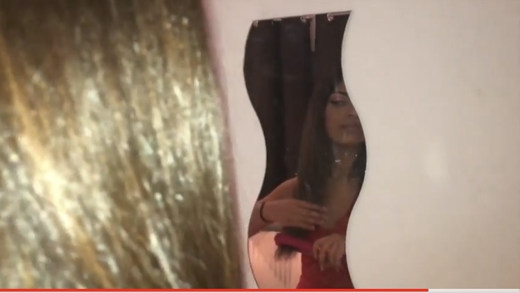
 In this scene we used a reflection shot which is common in grime. A reflection shot can give an impression on the audience on how the character looks and has opinions on themselves. For this scene the character has completely changed from before and towards the end is more concerned on herself rather than materialistic thing, such as the cars and watches. This interprets our orignial for both females as they looked more refreshed and healthier. This showed that they had bettered themselves and tried to live and follow their dream of looking wealthy form the start to finish.
Mise-en-Scene
The mise-en-scene interlinks with the narrative of our video. We used the outdoors to show what kind of environment they live in. This represented the hardship of every young child.
For example the window shopping is very common at a young age as its not possible to get a great paid job to afford designer brands. We revolved our music video around other people to represent friendships and how the people in the shopping center do not interact with young children and are segregated to fit in with society.
 In the party we discover that the first female has friends. We showed a positive relationship by using a friendly environment of people having a good time all together. This worked well as we could link this to the narrative of confidence as it was low at the start and higher towards the end.


In Grime music videos artists use a lot of natural environments and parties much like Belly Squad 'banana' (and remix) as we can see from these screenshots it a group of young people with positive vibes much like our scene. For our music video we wanted to interlink this factor so it can relate to the grime genre as we can see the audience gave back mostly positive feedback which is what we aim to do.
Digipak


Gender
We planning the process of our music video we had to deep gender representation. We wanted to challenge the stereotypical view of woman being an addition/object to the main male protagonist in a grime music video. We used the main protagonist as females with their own individual narrative. This shows that woman can also achieve and dream like males. Females are generally seen wearing tight, revealing clothing dancing around provocatively. We decided to use baggy comfy clothing that is suitable to weather condition much like reality. The image grime artists represent in their music video isn't a good image on the audience and can effect some. In addition, we challenged this stereotype to make every individual feel confident regardless of traits/characteristics.
Friday, 2 March 2018

Final Product - Digipak
Here is our digipak:
The top two images are front and back
The bottom two images are inside, left and right

The top two images are front and back
The bottom two images are inside, left and right

Monday, 26 February 2018
Final Product - Music Video
After working hard, using all the research we had gathered and taking the necessary steps, here is our music video:
Wednesday, 17 January 2018
Grime shots
Grime shots
As our music video falls under Grime i have played attetion to what allows the genre to be shown within the music video. This can be done in a number of ways; props, lighting, camera shots, characters, theme, age,. We have looked at many videos to see what is deemed appropriate and focused on a couple of shots that connect with grime and are common.


From a couple shots we can understand a grime video has the texture of a dim poor lifestyle not showing any type of warm feeling. This projects a hard lifestyle and a version of everyday reality. the characters used appear to be young with a sense of separation but also a unity to become bigger and better. The characters are not focused on up close this allows you to figure out what type of person they are (confusion). Panning, over head shots and long distance shots shows a journey and exploration. a use of juxtaposition.
Genre theory
genere theory
Within lessons at school we have looked at was genre interlinks with the message and theme of a music video. This has allowed me to think more wisely as the where my music video is shot, how its portraid and what age range will help promote the genre. Our chosen song has fallen into "grime". This will have an audience expectation to how it should be filmed. Grime currently involves a large group of people, reality settings (near a block of flats/on a estate), dark dingy colours, tracksuits, a struggled lifestyle and possibly the use of alcohol and drugs. Alongside these expectations we want to intertine a breakaway effect allowing the audience to see a positive outcome at the end of the video. This will allow our message to be shown. We want to show a hard life from the start (this will include the listed expectations up above) from then on we will show a change in life and how trying to be better turns out. to help show this we could use slow motion shots to grasp and show the main message in detail. Panning can be useful as it will show two differences (haven not figured what will be the differences) With our sense of fashion we want to include tracksuits but old versions as modern one will not show a poor lifestyle.
Planning process
Within the planning of the course we need to understand our aims and what we want to reach. This will be listed below:
music video
Any ideas (mindmap, pictures,word jotting)
Cast (auditions)
Costume (type of theme)
Safety (intervine with anything or anyone)
Sound effects
BBFC rating
Equipment (props)
Plan of filming days and location of shots
Updates about any new plans/discusions/ideas
Age range
Message (what do the words mean and signify)
magazine
Message within the magazine
Drafts/sketches/layout ideas
Theme (colour/font/words used)
Artsist
Create a final draft
Age group ?
digipak
Effect of the design
Message
Design
Theme
Age group
Any notes or drafts
Artists and pitch responses
Final design
Saturday, 13 January 2018
initial designs of the poster and digipak
Poster
 With our initial first design of a poster we created a mysterious black, dull poster. The poster as you can see isn't very bold and eye catchy. This could be due to the poster having too much writing on it. Due to our age range starting young, most children tend not to read too much and enjoy looking at artistic pictures. When designing this first draft we now understand what key concepts we now need to change. If our poster is kept like this it will look the same as everything else in a magazine is heavy and full on with writing. I think a black background should be kept as magazines are more colourful but as black is a bold, block colour, the simplicity will stand out.
To change and improve our poster we may use a key feature of our music video that is not to revealing but interesting. This will make the audience more interested into the release of the video as it can show the idea of a story. We also will reduce the writing to not confuse the audience. I think if writing is still produced white block letters should work well with a black background as it can be then clearly understood with a message. The message on this first design will not make sense either with the audience in the future and could mislead them when the video comes out. This could get bad ratings and criticism.
Digipak
With some error of the computer system this first draft is not amazing. The front of the packaging looks very childish and poorly constructed the only beneficial feature of this edit is the two faces makes sense and adds a sense of mystery for the audience. The face works well alongside the video as it corresponds to the main character. However that isn't just the only character and feature in the story, but this could work well as it will come as a better surprise to the audience. For the final design we should change the front from the poster as it just looks boring and repetitive.
 To improve it, more relevant information should be used to make it look professional. We also need to change the font. We could add a bar code to make it more realistic. We also need to work on sizing of the digipak as ours looks rectangular. This shape is not the shape of a CD pack as they are square.
We can still use a character not reveal too much about them as it will be effective to relate it to our video and make more sense.
 With our initial first design of a poster we created a mysterious black, dull poster. The poster as you can see isn't very bold and eye catchy. This could be due to the poster having too much writing on it. Due to our age range starting young, most children tend not to read too much and enjoy looking at artistic pictures. When designing this first draft we now understand what key concepts we now need to change. If our poster is kept like this it will look the same as everything else in a magazine is heavy and full on with writing. I think a black background should be kept as magazines are more colourful but as black is a bold, block colour, the simplicity will stand out.
To change and improve our poster we may use a key feature of our music video that is not to revealing but interesting. This will make the audience more interested into the release of the video as it can show the idea of a story. We also will reduce the writing to not confuse the audience. I think if writing is still produced white block letters should work well with a black background as it can be then clearly understood with a message. The message on this first design will not make sense either with the audience in the future and could mislead them when the video comes out. This could get bad ratings and criticism.
Digipak
With some error of the computer system this first draft is not amazing. The front of the packaging looks very childish and poorly constructed the only beneficial feature of this edit is the two faces makes sense and adds a sense of mystery for the audience. The face works well alongside the video as it corresponds to the main character. However that isn't just the only character and feature in the story, but this could work well as it will come as a better surprise to the audience. For the final design we should change the front from the poster as it just looks boring and repetitive.
 To improve it, more relevant information should be used to make it look professional. We also need to change the font. We could add a bar code to make it more realistic. We also need to work on sizing of the digipak as ours looks rectangular. This shape is not the shape of a CD pack as they are square.
We can still use a character not reveal too much about them as it will be effective to relate it to our video and make more sense.
Wednesday, 3 January 2018
Different genres of music videos
Megan Trainor
Genre - Pop
"Dear Future Husband"
Genre- Dance hall
"Clarks"
Genre- HipHop
"Privacy"
Taylor Swift
Genre - Country
"love Story"
Broods
Genre - Electro-pop
"Mother and Father"
Monday, 1 January 2018
A2 media studies music video evaluation
Through conducting my research i have watched a variety of A2 media studies music videos, following the same criteria. This has allowed me to focus on what has or has not worked out allowing me to improve and evaluate my final piece effectively. This will allow me to experiment different ways to present my message within the music video.
The music within this video is classified as "house". I have looked at house music video and understood the concept of a message. House music has a disconnected sound to it allowing people to let loose and reveal their emotions and personalities. In the video the character has different emotions shown. They have a great range of camera angles allowing it to sink with the music at the correct times. The use of reflections are throughout focusing on the emotions and feeling of the message. The panning or the hand held camera allows the audience to establish the lost environment the character is in and explore the journey with him. The underwater scene really captures the realism of how he wants to escape reality and get away. I found it enjoyable and interesting with the personal view of the protagonist and understood the message really clear as the music has no words to describe the feelings. Towards the end we discover its a flash back to the life he once lived. This was a great scene to show as we understood the type of person he is and what he enjoys doing. It allows the audience to relate to this feeling as we all have a dream or feeling to relive something we have once loved. This video relates to Brecht theory. It makes the audience aware what they are watching was not all reality but theatrical (a dream). it breaks the "Fourth Wall" and keeps the audience as observers to understand the message.
Saturday, 23 December 2017
To do list
We need to finish of recording:
The rich scene (rolex)
A recording of hate messages
Being with friends
Park scene
recording of significant objects
The rich scene (rolex)
A recording of hate messages
Being with friends
Park scene
recording of significant objects
Thursday, 21 December 2017
Analysis of "Shape of you"
"Shape of You"
The song"Shape of You" was originally a pop song by the artist Ed Sheeran. This was a popular song in the U.K that spread internationally. In the process of Sheerans fame the artist Yxng Bane remixed a version of his own, converting it to a grime theme. We can see the genre of pop has intertwined with grime allowing grime to become more popular. Technical convergence has helped the progression of grime and add visuals to a video to release and express feelings with a deeper meaning other than lyrics. Visuals have made artists popular and more recognised when featured in their own songs. The use of codes and conventions have developed powerfully throughout grime, this is seen by the use of hand held cameras panning the protagonist in an urban area; commonly used in grime videos. This reveals the environment and atmosphere the artist is trying to represent they come from in relation to the lyrics. The use of society members through out videos allows the audience relate to their meanings.Ed Sheeran (pop)
The original version of shape of you is by a pop artist Ed Sheeran. His message in the video describes how a relationship began at a bar and quickly lead to a bedroom. Sheeran hints at sexual interaction but doesn't go into depth but his description of sexual interaction allows us to understand it can help a relationship become deeper. He begins his song with "the club isn't the best place to find a lover so the bar is were i go" this enhances that he was looking for a true love by interacting in a calmer environment. The video compromises with the lyrics as it set in a boxing room which is something you "fight" for, in relation to the song he wants her love and eventually achieves it by fighting and working for it. The video is set in an urban area which is very common in grime and pop music, it helps tell a story. The lighting is a dark with dim blue lights that look like city lights, this effect makes it more mysterious and connects with the passion with the two people. The fashion in the video is sporty and helps us understand where the relationship began. The video focuses on boxing which is a use of icongraphy. Iconography can show the link between the person and the story by connecting the two. With Sheeran we can see this as the couple connect through the use of boxing.
Yxng Bane (Grime)
However much like Sheerans narrative it still revolves around a girls. In comparison we can distinctively see how grime is showed. We can see the use of drugs, and expensive car and designer clothing. In Sheerans none of that is deemed to be center of attention or cared for only. Banes video is primarily based on the girl dancing around him rather than with him. She is seem to be an object. The grime feel has a materialistic point of view to it. From this it helps us how to represent the grime genre as we can see what things the camera angles should show. We can also see the way Bane is more direct to to the camera as he sings the word at the camera more than Sheeran. This is big deal as it helps connect the public to the song and relate potentially. The environment is pretty empty from a the high top view to focus on the two characters. The lighting is natural and doesn't highlight anything in particular. The use of wealth shows from the car can signify what type of audience will be interested; we had thought the youth as the younger generations play more attention to the brands rather than an older. The characters used are much younger than the people in Sheerans which helps suggest the age range aswell. The story line in Sheerans is panned out and walked through as the grime version is as subjective and has more fast cut clips with a range of motion.
From gathering research for our final product we intend to interpret factors that were included in Bane's. However we may challenge the convention of the male role and allow a woman to take the lead as its commonly known for the woman to be the subject which we want to challenge to make ours more unique
Yxng bane - Rihanna
In the process of recording we had a trial practice of copying the same action and scene of a song called Rihanna by Yxng Bane. This allowed us to understand the message of grime and the traits needed to make a successful video. We thought practicing this would help find ideas of camera angles, props, positions and environment. In the video there is a clear edit of colour which helped us practice using final cut pro. It was useful to understand this as we have to use this in our music vdeo to help commence our video. A lot of editing on final cut pro allowed us to use transitions and the blade to piece together to allow it to run at the same time of the music video.
From our trial run we a understand that Grime artists tend to use a a story when creating a music video. The part we recorded from Banes video focused on a lonely, young woman that has been heart broken by a possible ex boyfriend that is attempting to contact her. The woman shows uncertainty and a negative energy. From the clothing worn we understand she doesn't care how she looks and wishes to not make an effort in her appearance. This can signify the upset she is suffering as nobody else shows her care or compassion. Clothing can tell a lot about a persons characteristics so we tried to copy this by using the over-sized, off the shoulder t-shirt. The setting in her kitchen but contrasted by the dim lighting signifies it may be late evening but perhaps she has just woken up. The woman acts distracted as if her mind has a lot to deal with. We can see this as she just sits around not doing anything and the panning of her environment. The prop of Smoking can also abuse her body that shows signs of dismissal upon herself.
For props we used a shisha pen that was equivalent to the smoke she was smoking. This worked effectively as the smoke was thick and visible allowing the audience to see the replica.
The camera angles helped us portray different emotions. The close up reaveals their feelings/emotions. The panning shows that maybe its a feeling that had lasted a long time. It also helps having a overhead view to show she is the vulnerable one. We used zoom to focus on the narative of being lonely and mimicing the narrative.
For future reference we will improve our environment to give of a deprived background of the person. The mise-en-scene introduces an individuals life. For our actual music video we will focus on being able to Show this by taking away most or any expensive items to tell this story. It is important that the audience can relate and understand our message as it will allow our video to have more views and praise to the production. When we conduct our music video we could consider lighting as it creates an atmosphere of emotions. Preferably for our video we want a dream conveyed so the use of shadows and dim lighting can show the struggle of their goal. "left in the dark".
Friday, 8 December 2017
Risk assessments
There are various risks to shooting/recording things, however as one of our shots will be in a shop we will need permission as they could think we are recording to gain information about the layout to potentially rob the place in the future or any other risk from recording the shop floor.
If a scene contains others as a shot of our character in contrast to a group of young adults we would need permission to record them as we will publicly put out he video and anyone could find information about the individual.
Props
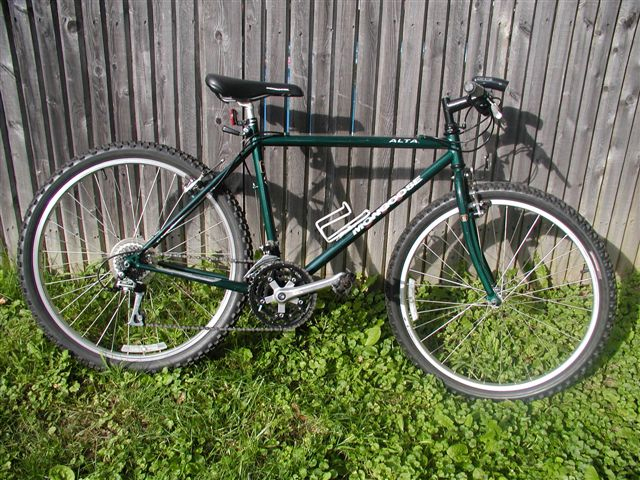
One of our props used in the music video shall be a used bike. This is used to show how the person lives his life on a daily. We want an old beaten/used bike as it shows the person has done mileage on the bike and uses it often.The bike will not be top of the range as we want to show how they build their fortune and climb the ladder to the top and travel in other way eventually. The tyres will be lat as it makes it tougher to travel and we are trying to emphasises his life is hard.

We aim to include expensive cars as it will contract with our character that they are not rich. I believe it will be effective as every young child dreams of living lavish and experience driving a big rich car.
Ideas for location


We had various ideas of locations to shoot in. One idea is on a real estate area that represents the lower working class people, that may potentially struggle to keep their earn. The use of estate is more of a real lifestyle that people will relate to as majority of the public dont live in big fancy houses. Graffiti-ed backgrounds represent the suffering of the youth and a way in which they express themselves; to capture this in a shot will help bring the urban/grime lifestyle into account for as is shows the abannedness in the life of our person and nobody cares about what they do. Graffiti is not allowed and using this shows the lifestyle of our person might not always be legal but its their way of living but mean no harm.
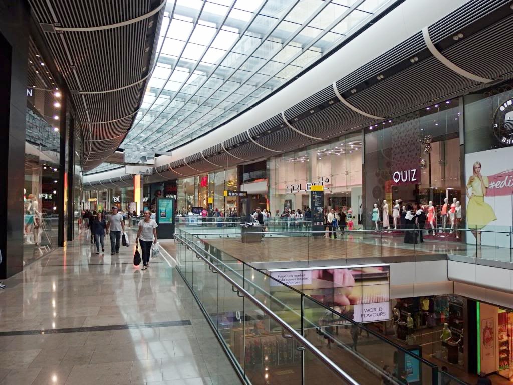


In contrast to the urban lifestyle we wanted to show the other side to life and how our person would like to live. Our first idea was to have our character watching others shop and window shop. This separates our persons lifestyle and how they know they need to change their lifestyle. By shooting in a shopping center that has high end fashion shops, which costs a lot of money to shop in our lead person will represent this as either a dream that would loved to be lived or is true and has worked their way up through the struggle and now live the opposite lifestyle. We need a shot of fancy objects preferably diamond/sparkly based this theme links to money as it looks expensive.
Subscribe to:
Posts (Atom)